
Page 260 - Industrial Process Plant Construction Estimating and Man Hour Analysis
P. 260
Statistical applications to construction Chapter 12 239
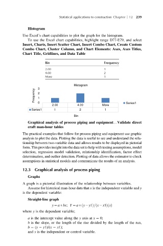
Histogram
Use Excel’s chart capabilities to plot the graph for the histogram.
To use the Excel chart capabilities, highlight range D77-E79, and select
Insert, Charts, Insert Scatter Chart, Insert Combo Chart, Create Custom
Combo Chart, Cluster Column, and Chart Elements: Axes, Axes Titles,
Chart Title, Gridlines, and Data Table
Bin Frequency
2.00 1
4.00 2
More 1
Histogram
3
Frequency 2
1
0
2.00 4.00 More Series1
Series1 1 2 1
Bin
Graphical analysis of process piping and equipment…Validate direct
craft man-hour tables
The practical examples that follow for process piping and equipment use graphic
analysis to plot the data. Plotting the data is useful to see and understand the rela-
tionship between two-variable data and allows results to be displayed in pictorial
form. Thisprovides insight into the data set to help with testingassumptions, model
selection, regression model validation, relationship identification, factor effect
determination, and outlier detection. Plotting of data allows the estimator to check
assumptions in statistical models and communicate the results of an analysis.
12.3 Graphical analysis of process piping
Graphs
A graph is a pictorial illustration of the relationship between variables.
Assume for historical man-hour data that x is the independent variable and y
is the dependent variable:
Straight-line graph
ð
ð
y ¼ a + bx; Y ¼ a + y y1Þ= x x1Þ xðÞ
where y is the dependent variable;
a is the intercept value along the y axis at x ¼ 0;
b is the slope, or the length of the rise divided by the length of the run,
b ¼ (y y1)/(x x1);
and x is the independent or control variable.