Page 248 - Applied statistics and probability for engineers
P. 248

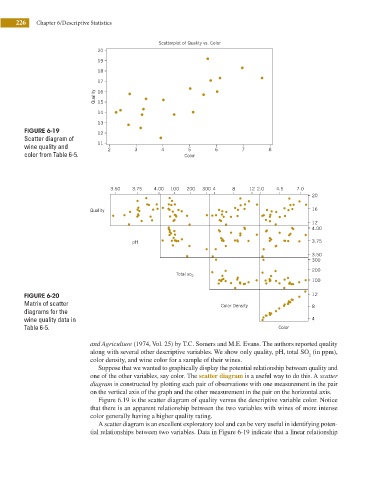
226    Chapter 6/Descriptive Statistics


                                                       Scatterplot of Quality vs. Color
                                     20
                                     19
                                     18
                                     17
                                    Quality  16
                                     15
                                     14
                                     13
               FIGURE 6-19           12
               Scatter diagram of
               wine quality and      11  2      3       4       5       6       7       8
               color from Table 6-5.                           Color


                                         3.50  3.75   4.00  100  200  300 4  8    12 2.0  4.5    7.0
                                                                                                     20

                                   Quality                                                           16
                                                                                                     12
                                                                                                     4.00

                                               pH                                                    3.75
                                                                                                     3.50
                                                                                                     300
                                                                                                     200
                                                            Total so 2
                                                                                                     100

               FIGURE 6-20                                                                           12
               Matrix of scatter                                          Color Density              8
               diagrams for the
               wine quality data in                                                                  4
               Table 6-5.                                                                  Color

                                   and Agriculture (1974, Vol. 25) by T.C. Somers and M.E. Evans. The authors reported quality
                                   along with several other descriptive variables. We show only quality, pH, total SO  (in ppm),
                                                                                                    2
                                   color density, and wine color for a sample of their wines.
                                     Suppose that we wanted to graphically display the potential relationship between quality and
                                   one of the other variables, say color. The scatter diagram is a useful way to do this. A scatter
                                   diagram is constructed by plotting each pair of observations with one measurement in the pair
                                   on the vertical axis of the graph and the other measurement in the pair on the horizontal axis.
                                     Figure 6.19 is the scatter diagram of quality versus the descriptive variable color. Notice
                                   that there is an apparent relationship between the two variables with wines of more intense
                                   color generally having a higher quality rating.
                                     A scatter diagram is an excellent exploratory tool and can be very useful in identifying poten-
                                   tial relationships between two variables. Data in Figure 6-19 indicate that a linear relationship
   243   244   245   246   247   248   249   250   251   252   253