Page 253 - Applied statistics and probability for engineers
P. 253

Section 6-7/Probability Plots     231


                                            (
                                                  )
                                                   /
                                                .
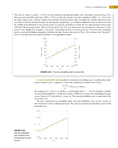
                     The pairs of values x  and  j − 0 5 10 are now plotted on normal probability axes. This plot is shown in Fig. 6-22.
                                       j ( )
                                                                                                                ]
                                                      (
                                                         0 5) /
                     Most normal probability plots have 100 j − .  n on the left vertical scale and (sometimes) 100 1− [  ( j −  0 5 . ) / n  on
                     the right vertical scale, with the variable value plotted on the horizontal scale. A straight line, chosen subjectively, has
                     been drawn through the plotted points. In drawing the straight line, you should be inluenced more by the points near

                     the middle of the plot than by the extreme points. A good rule of thumb is to draw the line approximately between the
                     25th and 75th percentile points. This is how the line in Fig. 6-22 was determined. In assessing the “closeness” of the
                     points to the straight line, imagine a “fat pencil” lying along the line. If all the points are covered by this imaginary
                     pencil, a normal distribution adequately describes the data. Because the points in Fig. 6-19 would pass the “fat pencil”
                     test, we conclude that the normal distribution is an appropriate model.

                                                 99.9                           0.1
                                                   99                           1
                                                   95                           5
                                                j – 0.5)/n  80                  20   j – 0.5)/n]
                                                   50
                                                                                50
                                                100(  20                        80   100[1 – (
                                                    5                           95
                                                    1                           99
                                                  0.1                           99.9
                                                    170  180  190  200  210  220
                                                                 x ( j)
                                               FIGURE 6-22  Normal probability plot for battery life.


                                            A normal probability plot can also be constructed on ordinary axes by plotting the stand-
                                         ardized normal scores z j against x j( )  where the standardized normal scores satisfy
                                                                     j − . 0 5
                                                                             (
                                                                                   )
                                                                          =  P Z ≤  z j = Φ( )
                                                                                        z j
                                                                      n
                                                                         )
                                                           5
                                                                  0
                                                                   5
                                         For example, if ( j − 0 . ) / n = 0 . ,Φ( z j =  . 0 05 implies that z j = − .1 64 . To illustrate, consider
                                         the data from Example 6-4. In the last column of Table 6-6 we show the standardized normal
                                         scores. Figure 6-23 is the plot of z j versus x  This normal probability plot is equivalent to the
                                                                            j ( ).
                                         one in Fig. 6-22.
                                            We have constructed our probability plots with the probability scale (or the z-scale) on

                                         the vertical axis. Some computer packages “ ip” the axis and put the probability scale on the
                                         horizontal axis.
                                           3.30
                                           1.65


                                         z j  0


                     FIGURE 6-23           –1.65
                     Normal probability
                     plot obtained from
                                           –3.30
                     standardized normal      170  180  190  200  210  220
                     scores.                               x  ( j)
   248   249   250   251   252   253   254   255   256   257   258