
Page 252 - Applied statistics and probability for engineers
P. 252
230 Chapter 6/Descriptive Statistics
6-7 Probability Plots
How do we know whether a particular probability distribution is a reasonable model for data?
Sometimes this is an important question because many of the statistical techniques presented
in subsequent chapters are based on an assumption that the population distribution is of a spe-
ciic type. Thus, we can think of determining whether data come from a specii c probability
distribution as verifying assumptions. In other cases, the form of the distribution can give
insight into the underlying physical mechanism generating the data. For example, in reliability
engineering, verifying that time-to-failure data come from an exponential distribution identi-
i es the failure mechanism in the sense that the failure rate is constant with respect to time.
Some of the visual displays we used earlier, such as the histogram, can provide insight about
the form of the underlying distribution. However, histograms are usually not really reliable indica-
tors of the distribution form unless the sample size is very large. A probability plot is a graphical
method for determining whether sample data conform to a hypothesized distribution based on a
subjective visual examination of the data. The general procedure is very simple and can be per-
formed quickly. It is also more reliable than the histogram for small- to moderate-size samples.
Probability plotting typically uses special axes that have been scaled for the hypothesized distri-
bution. Software is widely available for the normal, lognormal, Weibull, and various chi-square
and gamma distributions. We focus primarily on normal probability plots because many statistical
techniques are appropriate only when the population is (at least approximately) normal.
To construct a probability plot, the observations in the sample are irst ranked from small-
est to largest. That is, the sample x , x , … , x n is arranged as x , x , … , x , where x is the
2 ( )
1 ( )
1 ( )
n ( )
1
2
smallest observation, x is the second-smallest observation, and so forth with x n( ) the largest.
2 ( )
The ordered observations x j ( ) are then plotted against their observed cumulative frequency
( j − 0 . ) / n on the appropriate probability paper. If the hypothesized distribution adequately
5
describes the data, the plotted points will fall approximately along a straight line; if the plot-
ted points deviate signiicantly from a straight line, the hypothesized model is not appropriate.
Usually, the determination of whether or not the data plot is a straight line is subjective. The
procedure is illustrated in the following example.
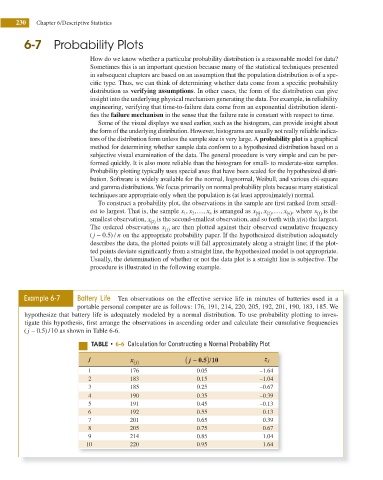
Example 6-7 Battery Life Ten observations on the effective service life in minutes of batteries used in a
portable personal computer are as follows: 176, 191, 214, 220, 205, 192, 201, 190, 183, 185. We
hypothesize that battery life is adequately modeled by a normal distribution. To use probability plotting to inves-
tigate this hypothesis, irst arrange the observations in ascending order and calculate their cumulative frequencies
( j − 0 . ) /10 as shown in Table 6-6.
5
5"#-& t 6-6 Calculation for Constructing a Normal Probability Plot
)
j x j ( ) ( j − 0.5 10 z j
/
1 176 0.05 –1.64
2 183 0.15 –1.04
3 185 0.25 –0.67
4 190 0.35 –0.39
5 191 0.45 –0.13
6 192 0.55 0.13
7 201 0.65 0.39
8 205 0.75 0.67
9 214 0.85 1.04
10 220 0.95 1.64