
Page 447 - Excel 2007 Bible
P. 447
26_044039 ch20.qxp 11/21/06 11:11 AM Page 404
Part III
Creating Charts and Graphics
specify. (Excel calculates the standard deviation of the data series.)
n Standard Error: The error bars are one standard error unit. (Excel calculates the standard error of
the data series.)
n Custom: You set the error bar units for the upper or lower error bars. You can enter either a value
or a range reference that holds the error values that you want to plot as error bars.
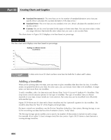
The chart shown in Figure 20.23 displays error bars based on percentage.
FIGURE 20.23
This line chart series displays error bars based on percentage.
A data series in an XY chart can have error bars for both the X values and Y values.
TIP n Standard Deviation(s): The error bars are in the number of standard-deviation units that you
TIP
Adding a trendline
When you’re plotting data over time, you may want to plot a trendline that describes the data. A trendline
points out general trends in your data. In some cases, you can forecast future data with trendlines. A single
series can have more than one trendline.
To add a trendline, select the data series and choose Chart Tools ➪ Layout ➪ Analysis ➪ >Trendline. This
drop-down control contains options for the type of trendline. The type of trendline that you choose
depends on your data. Linear trends are most common, but some data can be described more effectively
with another type.
Figure 20.24 shows an XY chart with a linear trendline and the (optional) equation for the trendline. The
trendline describes the “best fit” of the height and weight data.
For more control over trendlines, use the Format Trendline dialog box. One option, Moving Average, is use-
ful for smoothing out data that has a lot of variation (that is, “noisy” data).
The Moving Average option enables you to specify the number of data points to include in each average.
For example, if you select 5, Excel averages every five data points. Figure 20.25 shows a chart that uses a
moving average trendline.
404