
Page 450 - Excel 2007 Bible
P. 450
26_044039 ch20.qxp 11/21/06 11:11 AM Page 407
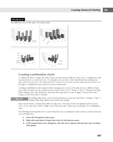
FIGURE 20.27
Four different views of the same 3-D column chart.
Creating combination charts Learning Advanced Charting 20
A combination chart is a single chart that consists of series that use different chart types. A combination chart
may also include a second value axis. For example, you may have a chart that shows both columns and
lines, with two value axes. The value axis for the columns is on the left, and the value axis for the line is on
the right. A combination chart requires at least two data series.
Creating a combination chart simply involves changing one or more of the data series to a different chart
type. Select the data series to change and then choose Chart Tools ➪ Design ➪ Type ➪ Change Chart Type.
In the Change Chart Type dialog box, select the chart type that you want to apply to the selected series.
Using a second Value Axis is optional.
If anything other than a series is selected when you issue the Chart Tools ➪ Design ➪ Type ➪
NOTE Change Chart Type, all the series in the chart change.
NOTE
Figure 20.28 shows a column chart with two data series. The values for the Precipitation series are very
low — so low that they’re barely visible on the Value Axis scale. This is a good candidate for a combination
chart.
The following steps describe how to convert this chart into a combination chart (column and line) that uses
a second Value Axis.
1. Select the Precipitation data series
2. Right-click and choose Format Data Series for the shortcut menu.
3. In the Format Data Series dialog box, click the Series Options tab and select the Secondary
Axis option.
407