
Page 460 - Excel 2007 Bible
P. 460
26_044039 ch20.qxp 11/21/06 11:11 AM Page 417
Learning Advanced Charting
Creating a Gantt chart
A Gantt chart is a horizontal bar chart often used in project management applications. Although Excel doesn’t
support Gantt charts per se, creating a simple Gantt chart is fairly easy. The key is getting your data set up
properly.
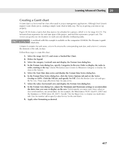
Figure 20.38 shows a Gantt chart that depicts the schedule for a project, which is in the range A2:C13. The
horizontal axis represents the total time span of the project, and each bar represents a project task. The
viewer can quickly see the duration for each task and identify overlapping tasks.
A workbook with this example is available on the companion CD-ROM. The filename is gantt
ON the CD-ROM
ON the CD-ROM
chart.xlsx.
Column A contains the task name, column B contains the corresponding start date, and column C contains
the duration of the task, in days.
Follow these steps to create this chart:
1. Select the range A2:C13, and create a Stacked Bar Chart.
2. Delete the legend.
3. Select the category (vertical) axis and display the Format Axis dialog box.
4. In the Format Axis dialog box, specify Categories In Reverse Order to display the tasks in 20
order, starting at the top. Choose Horizontal Axis Crosses At Maximum Category to display the
dates at the bottom.
5. Select the Start Date data series and display the Format Data Series dialog box.
6. In the Format Data Series dialog box, click the Series Options tab and set the Series
Overlap to 100%. Click the Fill tab, and specify No Fill. Click the Border Color tab and spec-
ify No Line. These steps effectively hide the data series.
7. Select the value (horizontal) axis and display the Format Axis dialog box.
8. In the Format Axis dialog box, adjust the Minimum and Maximum settings to accommodate
the dates that you want to display on the axis. Unfortunately, you must enter these values as
date serial numbers, not actual dates. In this example, the Minimum is 39181 (April 9, 2007) and
the Maximum is 39261 (June 28, 2007). Specify 7 for the Major Unit, to display one-week inter-
vals. Use the number tab to specify a date format for the axis labels.
9. Apply other formatting as desired.
417