
Page 458 - Excel 2007 Bible
P. 458
26_044039 ch20.qxp 11/21/06 11:11 AM Page 415
Learning Advanced Charting
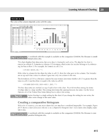
FIGURE 20.36
The color of the column depends varies with the value.
ON the CD-ROM A workbook with this example is available on the companion CD-ROM. The filename is condi- 20
ON the CD-ROM
tional colors.xlsx.
This chart displays four data series, but some data is missing for each series. The data for the chart is
entered in column B. Formulas in columns C:F determine which series the number belongs to by referenc-
ing the bins in Row 1. For example, the formula in cell C3 is
=IF(B3<=$C$1,B3,””)
If the value in column B is less than the value in cell C1, then the value goes in this column. The formulas
are set up such that a value in column B goes into only one column in the row.
The formula in cell D3 is a bit more complex because it must determine whether cell C3 is greater than the
value in cell C1 and less than or equal to the value in cell D1:
=IF(AND($B3>C$1,$B3<=D$1),$B3,””)
The four data series are overlaid on top of each other in the chart. The trick involves setting the Series
Overlap value to a large number. This setting determines the spacing between the series. Use the Series
Options tab of the Format Data Series dialog box to adjust this setting.
NOTE Series Overlap is a single setting for the chart. If you change the setting for one series, the
NOTE
other series change to the same value.
Creating a comparative histogram
With a bit of creativity, you can create charts that you may have considered impossible. For example, Figure
20.37 shows a chart sometimes referred to as a comparative histogram chart. Such charts often display popu-
lation data.
ON the CD-ROM A workbook with this example is available on the companion CD-ROM. The filename is com-
ON the CD-ROM
parative histogram.xlsx.
415