
Page 457 - Excel 2007 Bible
P. 457
26_044039 ch20.qxp 11/21/06 11:11 AM Page 414
Part III
Creating Charts and Graphics
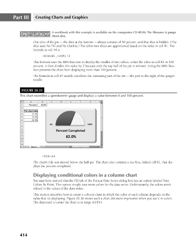
A workbook with this example is available on the companion CD-ROM. The filename is gauge
ON the CD-ROM
ON the CD-ROM
chart.xlsx.
One slice of the pie — the slice at the bottom — always consists of 50 percent, and that slice is hidden. (The
slice uses No Fill and No Outline.) The other two slices are apportioned based on the value in cell B1. The
formula in cell 44 is
=MIN(B1,100%)/2
This formula uses the MIN function to display the smaller of two values: either the value in cell B1 or 100
percent. It then divides this value by 2 because only the top half of the pie is relevant. Using the MIN func-
tion prevents the chart from displaying more than 100 percent.
The formula in cell A5 simply calculates the remaining part of the pie — the part to the right of the gauge’s
needle:
FIGURE 20.35
This chart resembles a speedometer gauge and displays a value between 0 and 100 percent.
=50%-A4
The chart’s title was moved below the half-pie. The chart also contains a text box, linked cell B1, that dis-
plays the percent completed.
Displaying conditional colors in a column chart
You may have noticed that the Fill tab of the Format Data Series dialog box has an option labeled Vary
Colors By Point. This option simply uses more colors for the data series. Unfortunately, the colors aren’t
related to the values of the data series.
This section describes how to create a column chart in which the color of each column depends on the
value that it’s displaying. Figure 20.36 shows such a chart (it’s more impressive when you see it in color).
The data used to create the chart is in range A1:F14.
414