
Page 456 - Excel 2007 Bible
P. 456
26_044039 ch20.qxp 11/21/06 11:11 AM Page 413
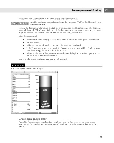
As you enter new data in column B, the formulas display the current results.
A workbook with this example is available on the companion CD-ROM. The filename is ther-
ON the CD-ROM
ON the CD-ROM
mometer chart.xlsx.
To make the thermometer chart, select cell B21 and create a column chart from that single cell. Notice the
blank cell above cell B21. Without this blank cell, Excel uses the entire data block for the chart, not just the
single cell. Because B21 is isolated from the other data, only the single cell is used.
Other changes required:
n Select the horizontal category axis and press Delete to remove the category axis from the chart.
n Remove the legend.
n Add a text box, linked to cell B21 to display the percent accomplished.
n In the Format Data Series dialog box (Series Options tab), set the Gap width to 0, which makes
n Select the Value Axis and display the Format Value Axis dialog box. In the Axis Options tab, set
the Minimum to 0 and the Maximum to 1.
Make any other cosmetic adjustments to get the look you desire.
FIGURE 20.34 the column occupy the entire width of the plot area. Learning Advanced Charting 20
This chart displays progress toward a goal.
Creating a gauge chart
Figure 20.35 shows another chart based on a single cell. It’s a pie chart set up to resemble a gauge.
Although this chart displays only one value (entered in cell B1), it actually uses three data points (in
A4:A6).
413