
Page 205 - The Handbook for Quality Management a Complete Guide to Operational Excellence
P. 205
192 P r o c e s s C o n t r o l Q u a n t i f y i n g P r o c e s s Va r i a t i o n 193
X X
0
M W F S M W F S M W F S M W F S
T T S T T S T T S T T S
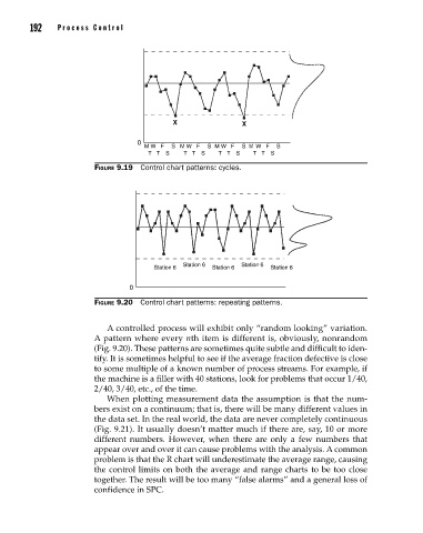
Figure 9.19 Control chart patterns: cycles.
Station 6 Station 6 Station 6 Station 6 Station 6
0
Figure 9.20 Control chart patterns: repeating patterns.
A controlled process will exhibit only “random looking” variation.
A pattern where every nth item is different is, obviously, nonrandom
(Fig. 9.20). These patterns are sometimes quite subtle and difficult to iden-
tify. It is sometimes helpful to see if the average fraction defective is close
to some multiple of a known number of process streams. For example, if
the machine is a filler with 40 stations, look for problems that occur 1/40,
2/40, 3/40, etc., of the time.
When plotting measurement data the assumption is that the num-
bers exist on a continuum; that is, there will be many different values in
the data set. In the real world, the data are never completely continuous
(Fig. 9.21). It usually doesn’t matter much if there are, say, 10 or more
different numbers. However, when there are only a few numbers that
appear over and over it can cause problems with the analysis. A common
problem is that the R chart will underestimate the average range, causing
the control limits on both the average and range charts to be too close
together. The result will be too many “false alarms” and a general loss of
confidence in SPC.
09_Pyzdek_Ch09_p151-208.indd 192 11/21/12 1:42 AM