
Page 64 - Applied Statistics Using SPSS, STATISTICA, MATLAB and R
P. 64
2.2 Presenting the Data 43
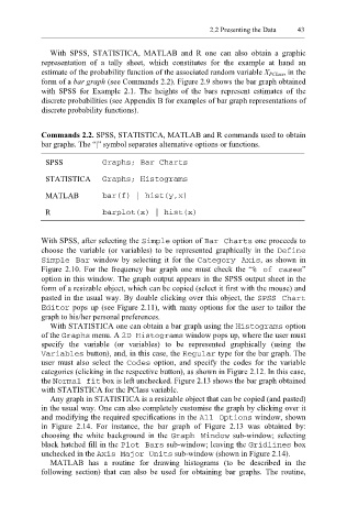
With SPSS, STATISTICA, MATLAB and R one can also obtain a graphic
representation of a tally sheet, which constitutes for the example at hand an
estimate of the probability function of the associated random variable X PClass, in the
form of a bar graph (see Commands 2.2). Figure 2.9 shows the bar graph obtained
with SPSS for Example 2.1. The heights of the bars represent estimates of the
discrete probabilities (see Appendix B for examples of bar graph representations of
discrete probability functions).
Commands 2.2. SPSS, STATISTICA, MATLAB and R commands used to obtain
bar graphs. The “|” symbol separates alternative options or functions.
SPSS Graphs; Bar Charts
STATISTICA Graphs; Histograms
MATLAB bar(f) | hist(y,x)
R barplot(x) | hist(x)
With SPSS, after selecting the Simple option of Bar C harts one proceeds to
choose the variable (or variables) to be represented graphically in the Define
Simple Bar window by selecting it for the Category Axis , as shown in
Figure 2.10. For the frequency bar graph one must check the “% of cases”
option in this window. The graph output appears in the SPSS output sheet in the
form of a resizable object, which can be copied (select it first with the mouse) and
pasted in the usual way. By double clicking over this object, the SPSS Chart
Editor pops up (see Figure 2.11), with many options for the user to tailor the
graph to his/her personal preferences.
With STATISTICA one can obtain a bar graph using the Histograms option
of the Graph s menu. A 2D Histograms window pops up, where the user must
specify the variable (or variables) to be represented graphically (using the
Variables button), and, in this case, the Regular type for the bar graph. The
user must also select the Codes option, and specify the codes for the variable
categories (clicking in the respective button), as shown in Figure 2.12. In this case,
the Normal fit box is left unchecked. Figure 2.13 shows the bar graph obtained
with STATISTICA for the PClass variable.
Any graph in STATISTICA is a resizable object that can be copied (and pasted)
in the usual way. One can also completely customise the graph by clicking over it
and modifying the required specifications in the All Op tions window, shown
in Figure 2.14. For instance, the bar graph of Figure 2.13 was obtained by:
choosing the white background in the Graph Window sub-window; selecting
black hatched fill in the Plot Bars sub-window; leaving the Gridl ines box
unchecked in the or Units Axis Maj sub-window (shown in Figure 2.14).
MATLAB has a routine for drawing histograms (to be described in the
following section) that can also be used for obtaining bar graphs. The routine,