
Page 68 - Applied Statistics Using SPSS, STATISTICA, MATLAB and R
P. 68
2.2 Presenting the Data 47
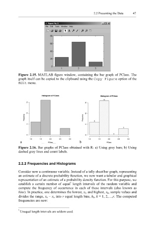
Figure 2.15. MATLAB figure window, containing the bar graph of PClass. The
graph itself can be copied to the clipboard using the Copy Figure option of the
Edit menu.
Figure 2.16. Bar graphs of PClass obtained with R: a) Using grey bars; b) Using
dashed gray lines and count labels.
2.2.2 Frequencies and Histograms
Consider now a continuous variable. Instead of a tally sheet/bar graph, representing
an estimate of a discrete probability function, we now want a tabular and graphical
representation of an estimate of a probability density function. For this purpose, we
2
establish a certain number of equal length intervals of the random variable and
compute the frequency of occurrence in each of these intervals (also known as
bins). In practice, one determines the lowest, x l, and highest, x h, sample values and
divides the range, x h − x l, into r equal length bins, h k, k = 1, 2,…,r. The computed
frequencies are now:
2
Unequal length intervals are seldom used.