
Page 65 - Applied Statistics Using SPSS, STATISTICA, MATLAB and R
P. 65
44 2 Presenting and Summarising the Data
hist(y,x) , plots a bar graph of the y frequencies, using a vector x with the
categories. For the PClass variable one would have to write down the following
commands:
» cat=[1 2 3]; %vector with categories
» hist(pclass,cat)
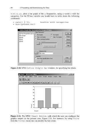
Figure 2.10. SPSS Bar Define Simple window, for specifying bar charts.
Figure 2.11. The SPSS Chart Editor , with which the user can configure the
graphic output (in the present case, Figure 2.9). For instance, by using Color
from the Format menu one can modify the bar colour.