
Page 66 - Applied Statistics Using SPSS, STATISTICA, MATLAB and R
P. 66
2.2 Presenting the Data 45
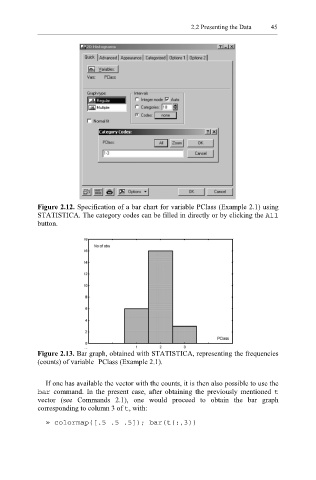
Figure 2.12. Specification of a bar chart for variable PClass (Example 2.1) using
STATISTICA. The category codes can be filled in directly or by clicking the All
button.
Figure 2.13. Bar graph, obtained with STATISTICA, representing the frequencies
(counts) of variable PClass (Example 2.1).
If one has available the vector with the counts, it is then also possible to use the
bar command. In the present case, after obtaining the previously mentioned t
vector (see Commands 2.1), one would proceed to obtain the bar graph
corresponding to column 3 of , with:
t
» colormap([.5 .5 .5]); bar(t(:,3))